Monday 28 March 2011
A 'Dash' of Inspiration
Here is the opening credits scene to James Bond - Casino Royale. It was created by Daniel Kleinman. What I admire about this animation is the way that everything flows into the net part. The aspect I like about this design is the way Daniel Kleinman sticks to the theme of a casino with the typical casino design and also the use of playing card symbols well as he uses them for weapons and alsobullets. He also kept with the casino theme and involved the action side of the move when he has the gun targets transforming into roulette wheels. The way he uses colours are good as well as Daniel Kleinman uses the hearts and diamond shapes to represent blood.
My Favourite Animated Movie
The reason why I like these animated movies is because the characters have emotions and as humans we can relate to their feelings. A good example of this is when Mufasa dies in The Lion King and Simba's begging him to wake up it becomes emotional and we want to help him out, hoping Mufasa wakes up. when creating my final piece i will take this into consideration.
The Lion King
Monsters Inc
This is another Example
Songs that make me want to party
Serani - No Games
Lethal Bizzle - Forwards Riddim (POW)
T2 ft Jodie Aysha - Heartbroken
Notorious BIG - Juicy
Paleface - Do You Mind (Crazy Cousin Remix)
Tinchy Stryder ft Sway, Chipmunk - Take Me Back
J Lo - Love Don't Cost A Thing
112 ft Notorious Big, Mase - Only You
DJ Luck & MC Neat ft JJ - Ain't No Stoppin' Us
DJ Luck & MC Neat - Something In Your Eyes
This list are songs that put me into a party mood. Songs Such As "DJ Luck & MC Neat ft JJ - Ain't No Stoppin' Us, Something In Your Eyes and T2 ft Jodie Aysha - Heartbroken" gets me pumped up and ready for the night. After a few, songs such as "Notorious BIG - Juicy and J Lo - Love Dont Cost A Thing" puts the cherry on the cake. When hearing them songs later on it reminds me of that night.
Songs that make me feel Sad....
Whitney Houston - I Will Always Love You
James Blunt - You're Beautiful
Eminem ft Dido - Stan
So Solid Crew - Broken Silence
Terence Jay - One Blood
Bob Marley - No Woman No Cry
Daniel Merriweather - Red
When listening to "Whitney Houston's - I Will Always Love You" I become slightly emotional. This is because after all her struggles and grief betweens her relationship she still is committed to Bobby Brown. This song is very painful, when she hits the high note it is almost as she is screaming out in pain. Other songs such as "James Blunt's - Your Beautiful" has a Strong Impact on me as it takes me back to a dark time in my time. The lyrics are very powerful in the song.
Songs that make me feel happy....
Rusted Roots- Send Me On My Way
Billy Ocean - Caribbean Queen
Bob Marley- One Love
Gabrielle - Dreams Can Come True
Ub40 - Red, Red Wine
Marvin Gaye - Sexual Healing
Chaka Khan - Ain't Nobody
Above is a sample of music that when listened to makes me feel happy and ready for the day. I decided to select a sample rather than one song as I found it difficult to rule out the others. When I hear "billy oceans - Caribbean Queen" it puts a smile on my face and i feel forced to sing along. the biggest question i've been asking myself is whether the lyrics make up the song or the beat does. for some songs such as "gabrielle's - dreams can come true" i feel that they lyrics make the sound good. other sounds such as "rusted Roots - Send Me On My Way" the beat makes it a good song. it helps if it is a right balance like Bob Marley's - One Love".
Tuesday 15 March 2011
Process of Poster Design
So you may be wondering how I created this poster therefore I have taken screen shots at certain parts of the process. I will keep it brief....
I firstly cropped my image.

I then added a perspective to the image to make it straight

After this is I used auto contrast

I manually brighten the image

After this I Sharpened the Image

To make sure everything lined up I used a grid.

I then cut off the creases from the page. As well as this I used a clone tool to get rid of some unwanted marks.

I finally changed the paper size to A2 ready for printing

What a 'Dash-ing' Final Poster Design
What a 'Dash-ing' Final Poster Design
This is my final Poster Design. I have Created this Design by cutting 100 blue pieces of card, 100 green pieces of card and a 100 white pieces of card. this was so that the design will correspond with the brief really well. I used green, blue and white card because i wanted a dark, medium and light so that it will bright out the tones. it also is a good way to capture shadows. i went for the traditional rectangular poster layout because i still wanted to keep the formal aspect to it. i could of gone with a new look such as the colour blind test root and used a circle but i feel that this way works better.

This is my final Poster Design. I have Created this Design by cutting 100 blue pieces of card, 100 green pieces of card and a 100 white pieces of card. this was so that the design will correspond with the brief really well. I used green, blue and white card because i wanted a dark, medium and light so that it will bright out the tones. it also is a good way to capture shadows. i went for the traditional rectangular poster layout because i still wanted to keep the formal aspect to it. i could of gone with a new look such as the colour blind test root and used a circle but i feel that this way works better.

Yulia Brodskaya
A 'dash' of Inspiration
Below is Yulia Brodskaya work. What I admire about her work is the attention to detail that she puts in. Although the images may seem as there 2D they are actual 3D also constructed with paper and in fairness are paper sculptures. this has really inspired me to create a 3D form when creating my poster. I will take her style into consideration when creating my poster.


Below is Yulia Brodskaya work. What I admire about her work is the attention to detail that she puts in. Although the images may seem as there 2D they are actual 3D also constructed with paper and in fairness are paper sculptures. this has really inspired me to create a 3D form when creating my poster. I will take her style into consideration when creating my poster.


Colour Blind Test
What a 'Dashful' Pattern
One day when I was browsing through the internet I came across a strange looking pattern. I though I was hallucinating when I could see a number within dot, but then after thoroughly researching (google images) I found that that they where colour blind test. What I like about this design is that the lettering or number is camouflage. I will consider this Design when creating my Poster


One day when I was browsing through the internet I came across a strange looking pattern. I though I was hallucinating when I could see a number within dot, but then after thoroughly researching (google images) I found that that they where colour blind test. What I like about this design is that the lettering or number is camouflage. I will consider this Design when creating my Poster


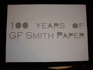
100 years of GF Smith Paper!
A Quick 'Dash' of Poster and Layouts
Below are some poster designs that I came up with. I hand cut out the letters for all the following poster designs. No layer cutter was used in this process. I wanted to keep both parts of the part that I cut. This was so that I can manipulate fonts with different colours, and with the letter I could test out different layouts.
For this poster design I used the white letter cut out sheet and but a green card underneath it. I found that the results where not as good because the doesn't really stand out as green with the white for some reason.

With this poster design I played with the letters to find a suitable layout for the text on green card. I feel that the white really stands out on this card.

For the following two designs I wanted to incorporate the theme of celebration therefore I used a party popper and the confetti found inside to expand on the theme. I also re-arranged the letters so that it has a feel that they are bursting out of the party popper.


With the next five poster designs I did the same method just changed the colour of the card to note the effect it has on the design. I found that it has a very smooth and soft look to it.


For the final poster design I went bak to the 'old skool' and used black and white.

Its Time to 'Dash' to Task 2

For Task 2 i am going to create a poster celebrating 100 years of GF Smiths Paper. throughout this task i will focus on incorporating the theme of 100 years and celebration.
Monday 14 March 2011
My Final Piece
A 'Dash' Of brilliance
This is my final sculpture. The sculpture is based on a human rib cage structure. I feel that it works well because it answers the sub brief I set which was not to create a replica of a bone structure but a sculpture that imitates it well. I feel that this is a good sculpture as it captures great lighting tones and shadows. This is a very important aspect as I will be placing the sculpture in the atrium. By combing the four pieces of card the sculpture become symmetrical as all four sides are the same shape and size. All the folds are 20mm shorter (10mm on both sides) than the previous one.


This is my final sculpture. The sculpture is based on a human rib cage structure. I feel that it works well because it answers the sub brief I set which was not to create a replica of a bone structure but a sculpture that imitates it well. I feel that this is a good sculpture as it captures great lighting tones and shadows. This is a very important aspect as I will be placing the sculpture in the atrium. By combing the four pieces of card the sculpture become symmetrical as all four sides are the same shape and size. All the folds are 20mm shorter (10mm on both sides) than the previous one.


Thursday 10 March 2011
A 'dash' of Idea's
Rib Cage Design
For this design I have focused on the human rib cage structure and here is my out come. I started off with a smaller piece at the top and when back to normal further down. I feel that this design would work better if it was upside down as the rib cage starts off wide and goes narrow.


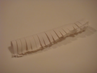
Make that another Rib cage design to go!
This is one of my better designs. I constructed this design by cutting slots and twisting them over to form the curve shape. I then used the other strip of card to fix it on. What I admire mostly of this this design is the shadows that it forms. They really are just beautiful.


Spinal Cord Design
I decided to try a different bone structure so I picked the spinal cord. The way I constructed this by cutting slots either side of the paper leaving just a strip in the middle and curving the slots in connecting them using the same method as the previous rib cage design.


Rib Cage Design x3
Yet again here is another rib cage design. I don't really like this design because it doesn't really work with the structure.


Rib Cage Design x4
This is one of my better designs. I took the simple shape created four in total and then combined them together to see the form it reveals. I feel that I can take this design to the next stage.


For this design I have focused on the human rib cage structure and here is my out come. I started off with a smaller piece at the top and when back to normal further down. I feel that this design would work better if it was upside down as the rib cage starts off wide and goes narrow.


Make that another Rib cage design to go!
This is one of my better designs. I constructed this design by cutting slots and twisting them over to form the curve shape. I then used the other strip of card to fix it on. What I admire mostly of this this design is the shadows that it forms. They really are just beautiful.


Spinal Cord Design
I decided to try a different bone structure so I picked the spinal cord. The way I constructed this by cutting slots either side of the paper leaving just a strip in the middle and curving the slots in connecting them using the same method as the previous rib cage design.


Rib Cage Design x3
Yet again here is another rib cage design. I don't really like this design because it doesn't really work with the structure.


Rib Cage Design x4
This is one of my better designs. I took the simple shape created four in total and then combined them together to see the form it reveals. I feel that I can take this design to the next stage.


Subscribe to:
Posts (Atom)