A Quick 'Dash' of Poster and Layouts
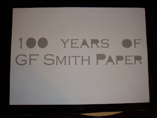
Below are some poster designs that I came up with. I hand cut out the letters for all the following poster designs. No layer cutter was used in this process. I wanted to keep both parts of the part that I cut. This was so that I can manipulate fonts with different colours, and with the letter I could test out different layouts.
For this poster design I used the white letter cut out sheet and but a green card underneath it. I found that the results where not as good because the doesn't really stand out as green with the white for some reason.
With this poster design I played with the letters to find a suitable layout for the text on green card. I feel that the white really stands out on this card.
For the following two designs I wanted to incorporate the theme of celebration therefore I used a party popper and the confetti found inside to expand on the theme. I also re-arranged the letters so that it has a feel that they are bursting out of the party popper.
With the next five poster designs I did the same method just changed the colour of the card to note the effect it has on the design. I found that it has a very smooth and soft look to it.
For the final poster design I went bak to the 'old skool' and used black and white.


No comments:
Post a Comment